BRAND
GUIDELINES
GUIDELINES
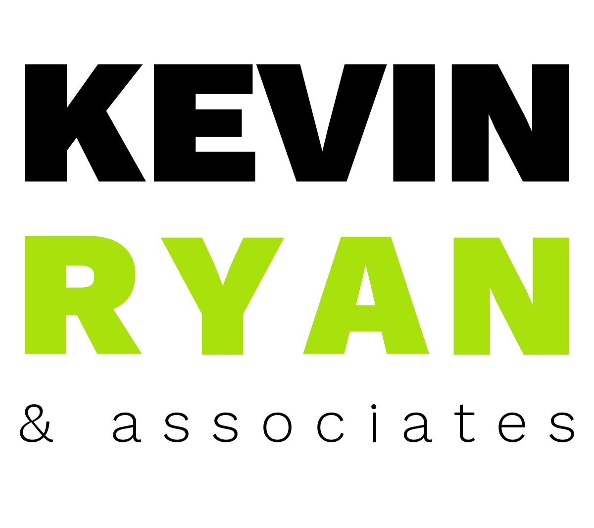
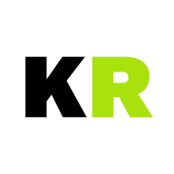
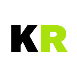
The primary logo uses Work Sans Black for KEVIN and RYAN, stacked to equal visual width using letter-spacing on RYAN. The lighter "& associates" underlines the full width. Work Sans is the only typeface used in the logo — it is distinct from the site body (Archivo) and display (Bebas Neue) fonts.
 Primary — Light Background
Primary — Dark Background
Primary — Light Background
Primary — Dark Background
Maintain clear space around the logo equal to the cap height of the letter K. No other graphic elements, text, or edge boundaries should intrude into this zone.
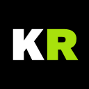
The primary logo should not be reproduced smaller than 120px wide for digital or 30mm wide for print. Below this size, use the KR monogram instead.
The logo is available in four configurations. Use the appropriate variant based on the background context. The lime green of RYAN never changes across any variant.
Standard — Light Background
Reversed — Dark Background
Standard — Warm White (#F5F3EF)
Reversed — Dark Grey (#2E2D2B)
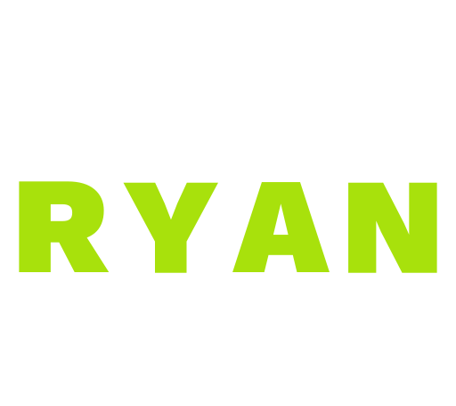
KEVIN is always black (#0A0A0A) on light backgrounds, white on dark. RYAN is always lime #A8E10C regardless of background. "& associates" follows KEVIN. The lime must never be altered, lightened, darkened, or replaced.
SVG (outlined paths) is the master format. PNG rasters are provided at 256, 512, 800, and 1200px. ICO files at 16/32/48px are provided for browser favicons. All files hosted at kevinryan.io/brand/.
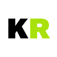
The KR monogram is the compact form of the identity. Use it for app icons, social media avatars, favicons, and anywhere the full logo would be illegible at small sizes. Same colour rules apply.
 Dark
Dark
 Light
Warm White
Dark Grey
Light
Warm White
Dark Grey
Legible from 16px (favicon) to 512px. Provided: 16/32/48px (favicon), 64/128/192/256/512px (app icons), 400/800px (social media).
The palette is taken directly from the kevinryan.io CSS custom properties. It uses warm neutrals and a single lime accent. The warm off-white (#F5F3EF) gives the site its distinctive warmth.
The site uses three typefaces with distinct roles. Archivo for body text, Bebas Neue for display headings, and Work Sans exclusively for the logo mark. This separation gives the logo its own identity while the editorial feel comes from Archivo and Bebas Neue.
Section headings, numbers (01–09), capability titles, case study names. Always uppercase, letter-spacing 0.02em, line-height 0.88–0.92.
Body text, navigation, labels, buttons, metadata. Weights 400–900. Line-height 1.6.
Black (900) for KEVIN/RYAN. Light (300) for "& associates". Not used elsewhere on site.
| Role | Font | Size | Usage |
|---|---|---|---|
| Display XL | Bebas Neue | clamp(4.5rem, 13vw, 12rem) | Hero heading, section titles |
| Display LG | Bebas Neue | clamp(2.5rem, 7vw, 6rem) | Section headings |
| Section No. | Bebas Neue | clamp(3.5rem, 5.5vw, 5.5rem) | Section numbers (01–09) |
| Body | Archivo 400 | 1.05rem / lh 1.7 | Paragraph text |
| Label | Archivo 700 | 0.7rem / ls 0.18em | Subtitles, tags, uppercase |
| Button | Archivo 800 | 0.72rem / ls 0.14em | CTAs, nav links, uppercase |
| Caption | Archivo 700 | 0.68rem / ls 0.12em | Stats labels, metadata |
Archivo: fonts.google.com/specimen/Archivo — weights 400, 500, 600, 700, 800, 900
Bebas Neue: fonts.google.com/specimen/Bebas+Neue — single weight
Work Sans: fonts.google.com/specimen/Work+Sans — weights 300, 900 (logo only)
The layout uses an 8px base grid with a maximum content width of 1400px and fluid padding via clamp(1.5rem, 5vw, 6rem). Section padding is 7rem (112px) vertically.
clamp(1.5rem, 5vw, 6rem) — responsive fluid padding.These rules protect the integrity of the identity. When in doubt, refer to the master SVG files and this document.
Every asset below is served from brand.kevinryan.io. Click any URL to open the file directly. SVG master files are the canonical source — use PNGs only where SVG is not supported.


